Back home
The challenge
Five seconds to explain an AI that builds apps.
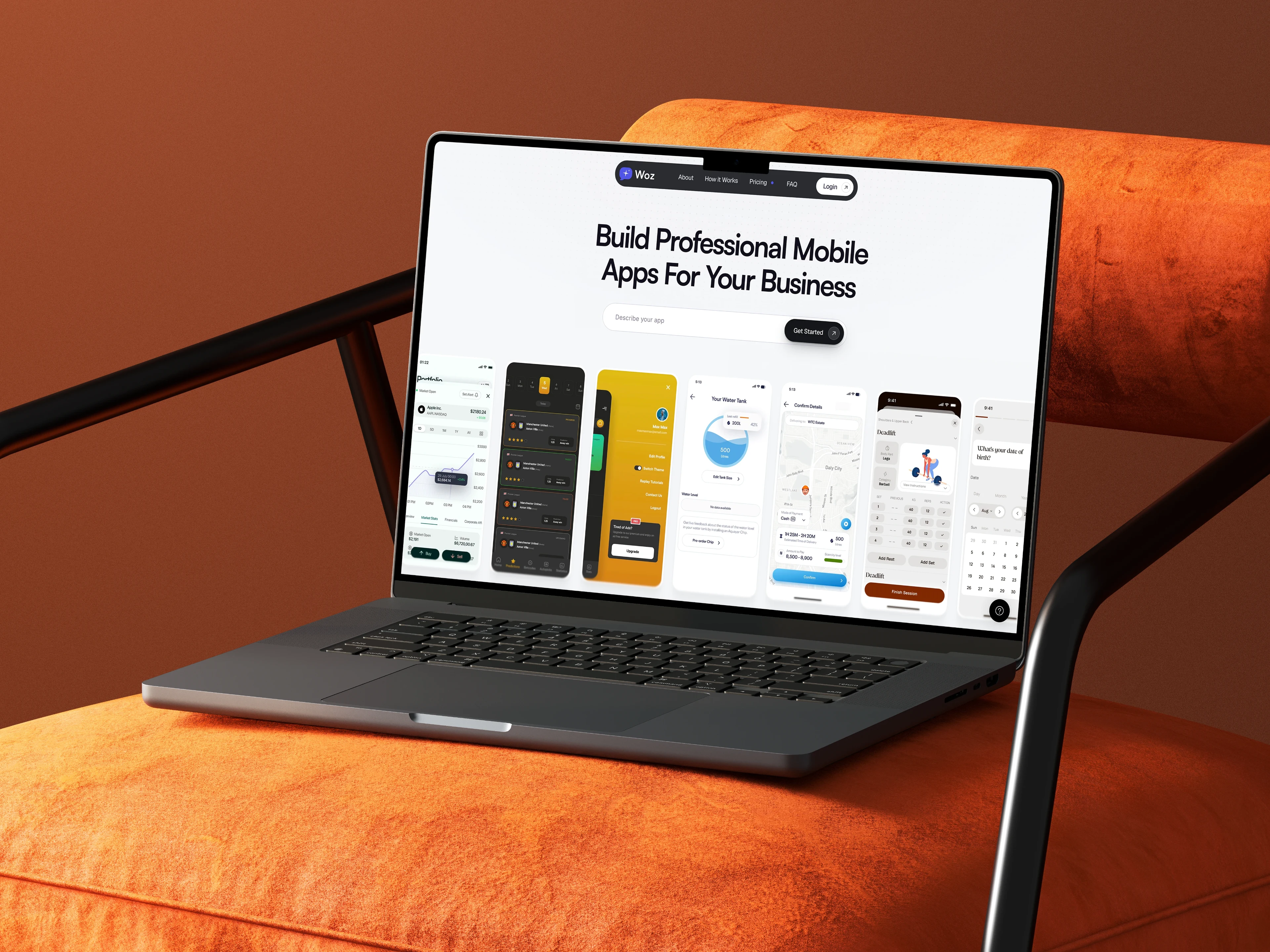
Woz needed a landing page that explained the product plainly, caught attention fast, and converted curious visitors into early users or leads. The old page did none of that clearly enough to carry a pitch.
The brief
Week 1I started with the founder's vision, gathered through async messages and Looms. Before drawing anything, I asked two direct questions. Every layout that followed answered them.
What's the single most important thing a user should know after 5 seconds?
Do we want to build hype, or guide with clarity?
The explorations
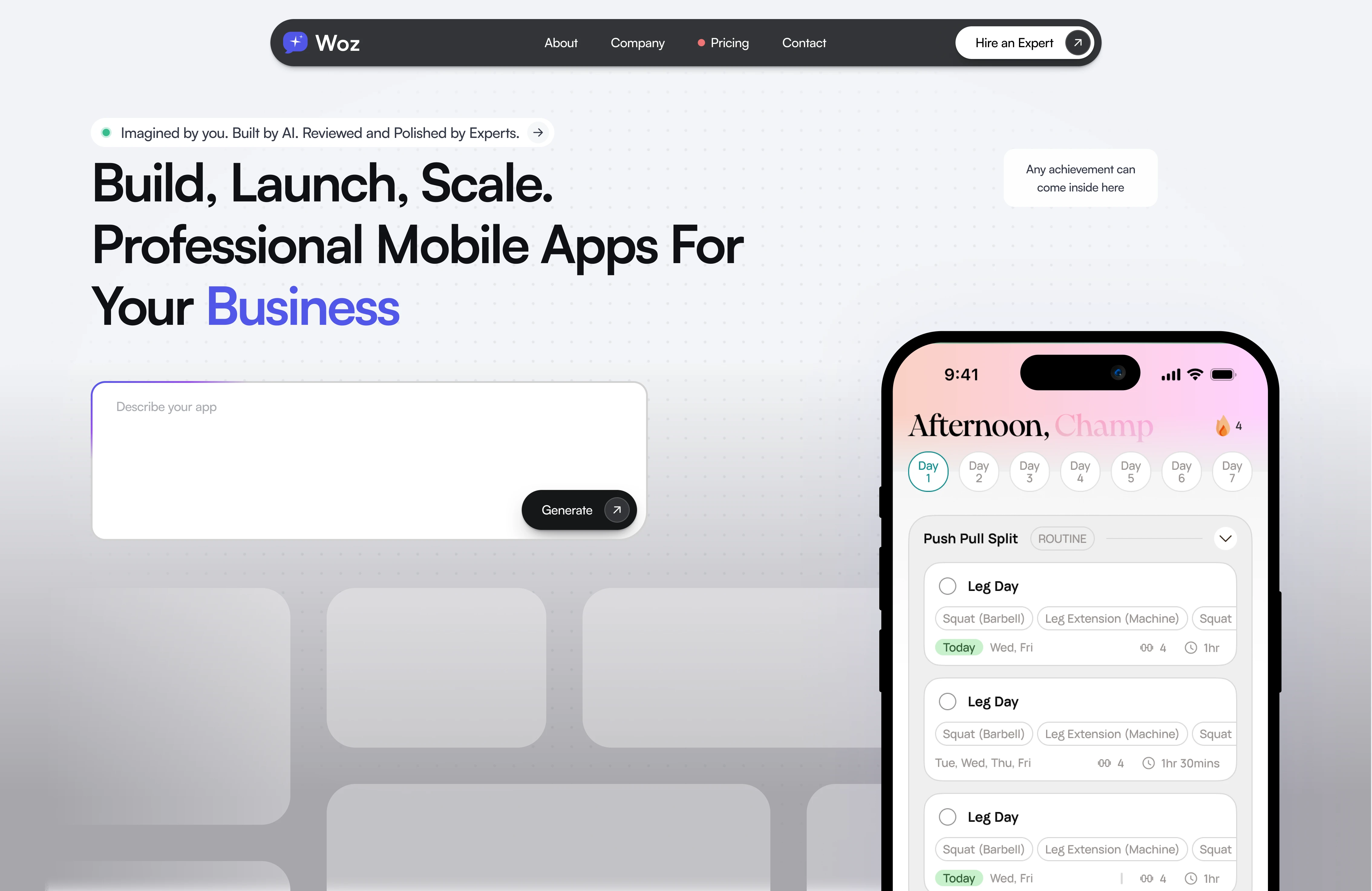
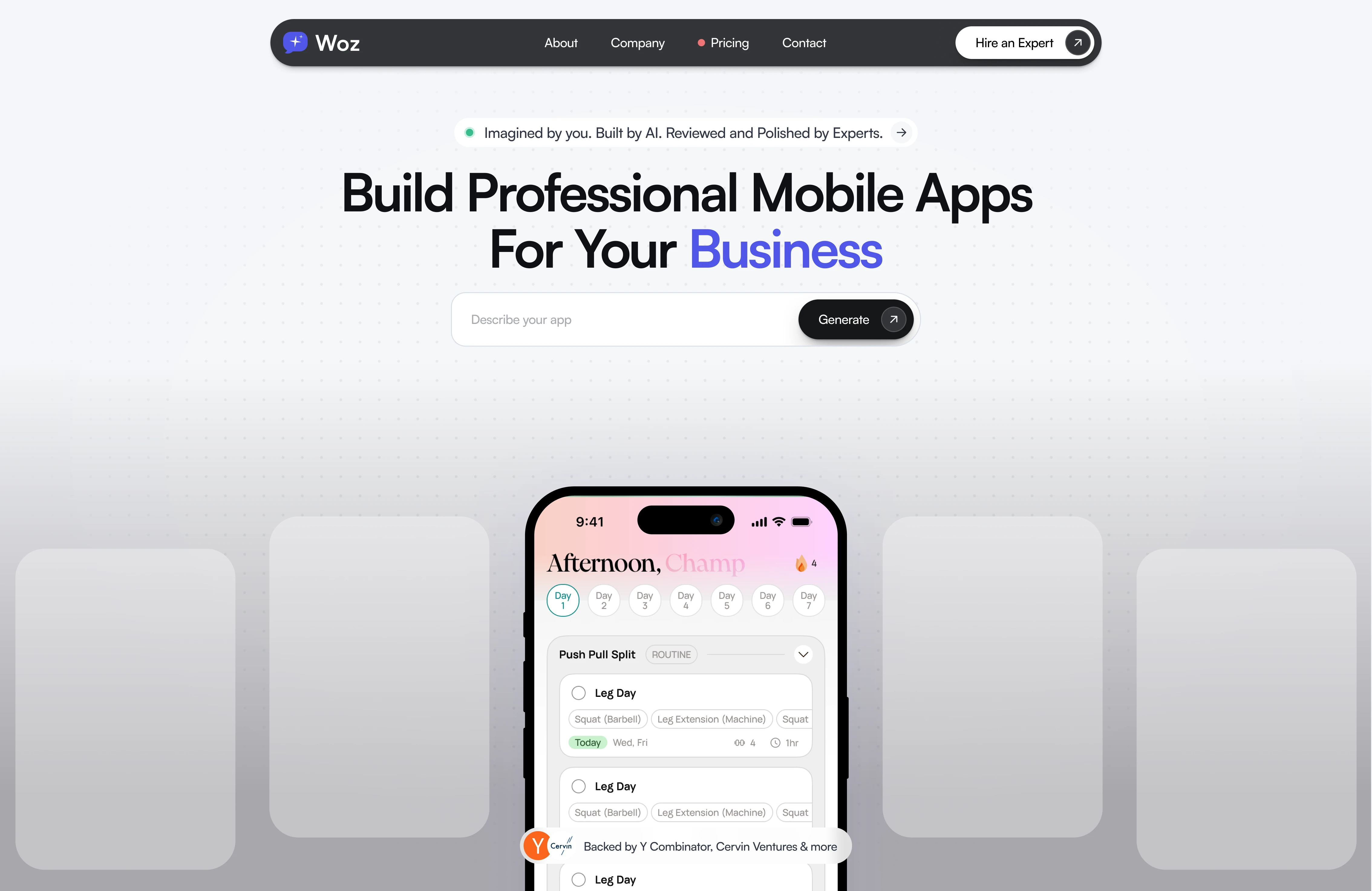
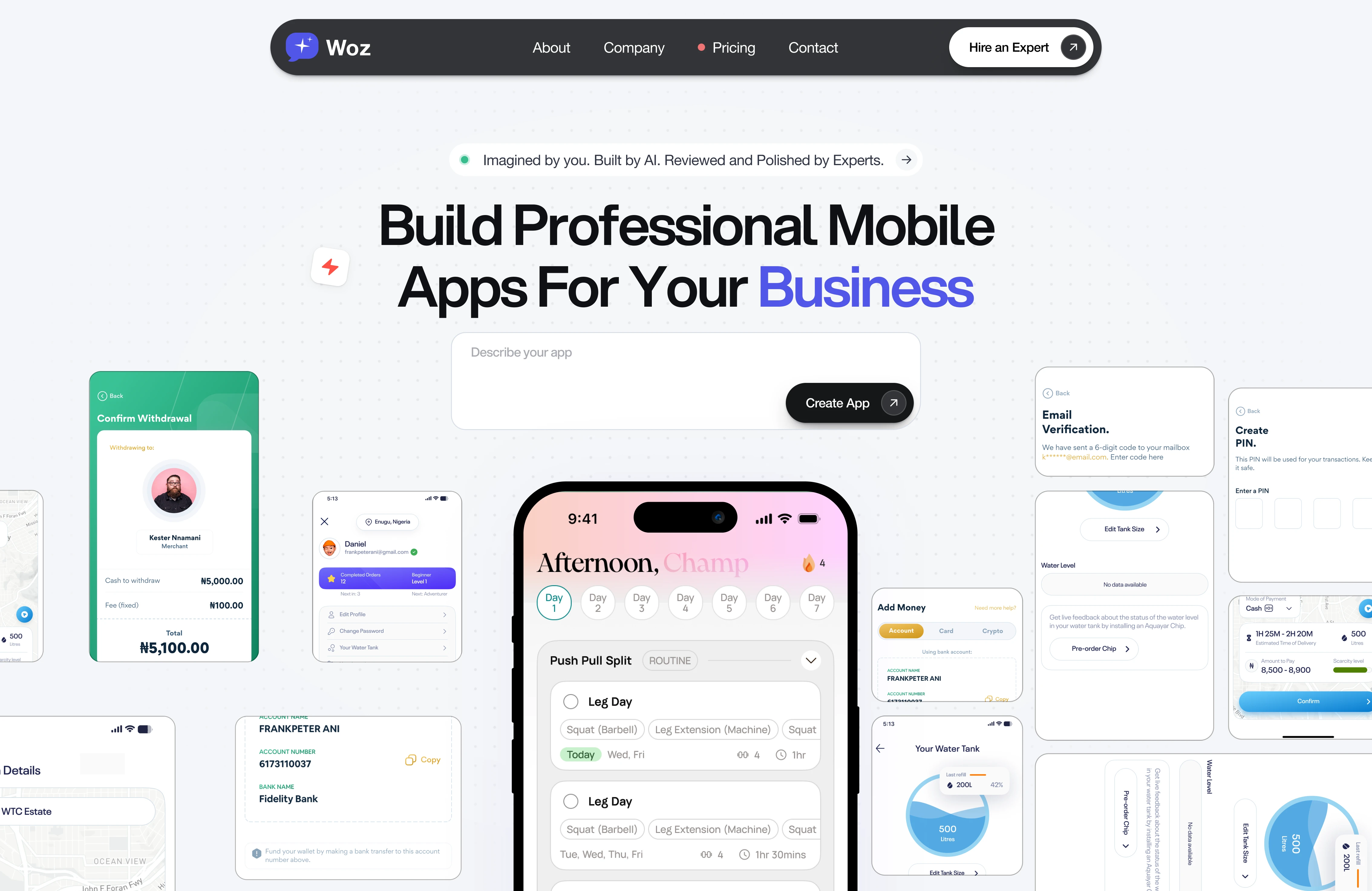
A bold hero with a looping video of prompt-to-app generation.
A simple value-prop stack with icons and scroll-in animations.
A split layout, one side showing AI components flowing in motion.
The founders chose hero-first clarity. These are the heroes that didn't make the cut.
The direction
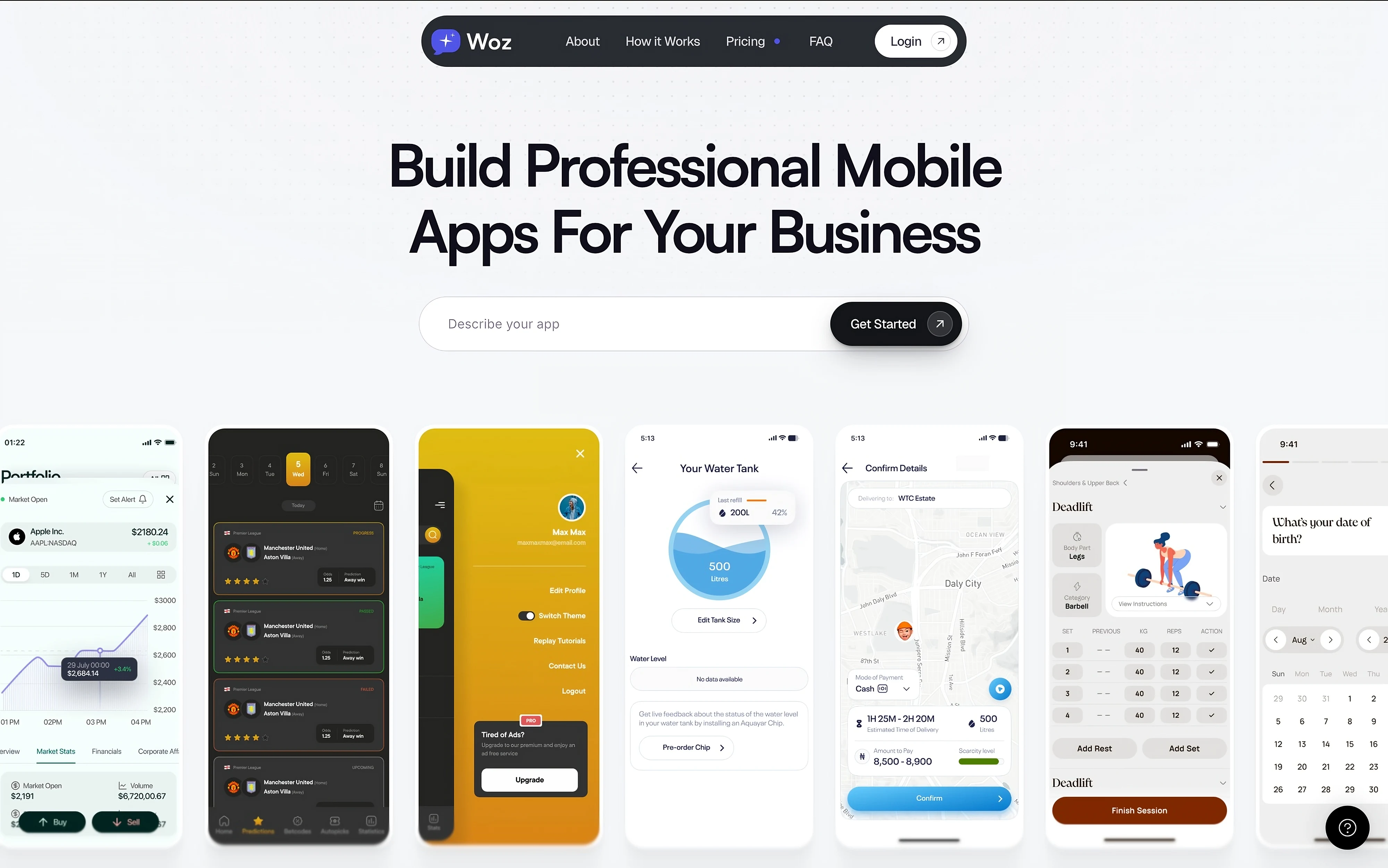
Clarity over hype. Show the apps, not the AI.
We landed on a simple, clean page built around the mobile apps themselves. Real snapshots of what Woz can build convert better than any explanation of how it works.
The refinement
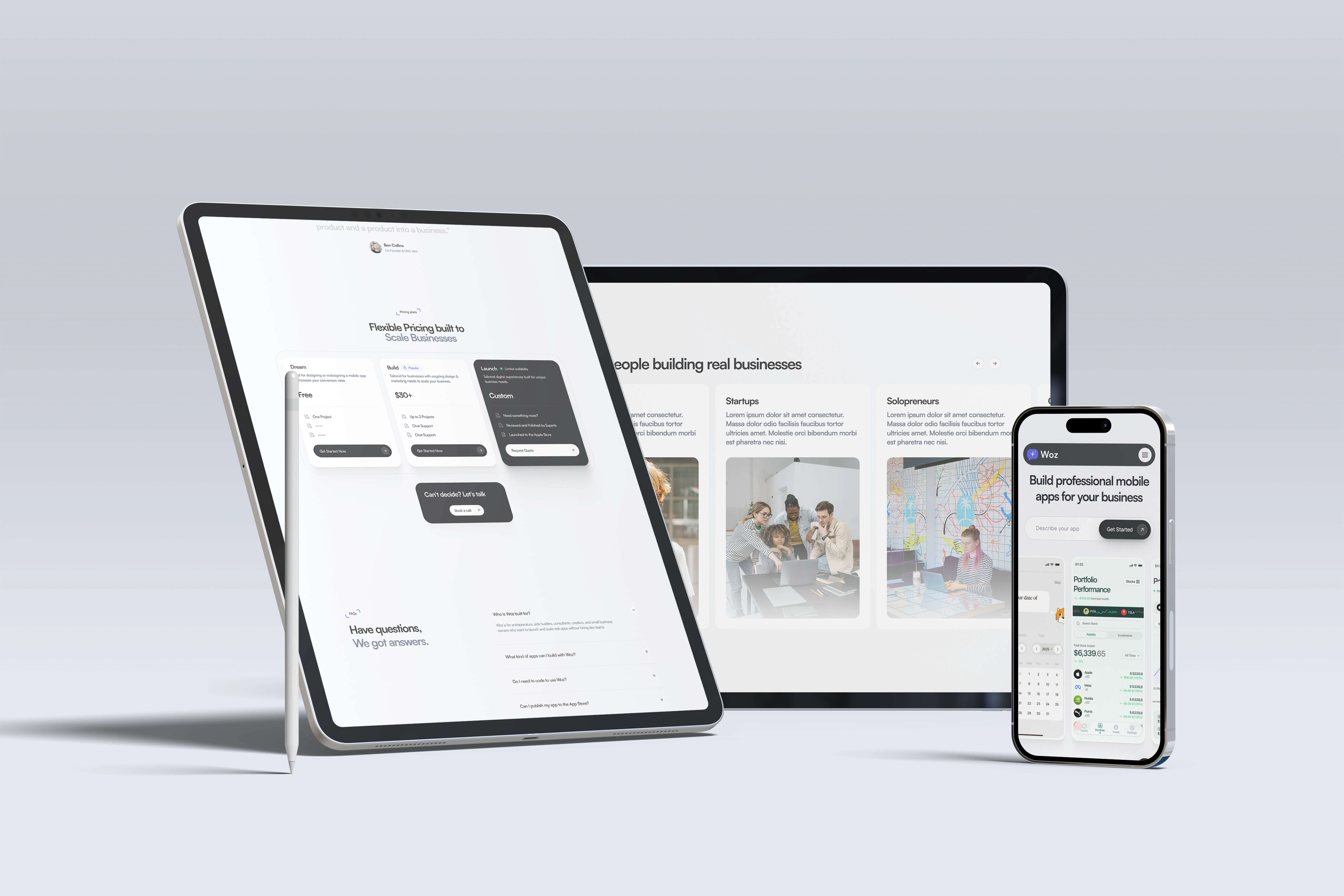
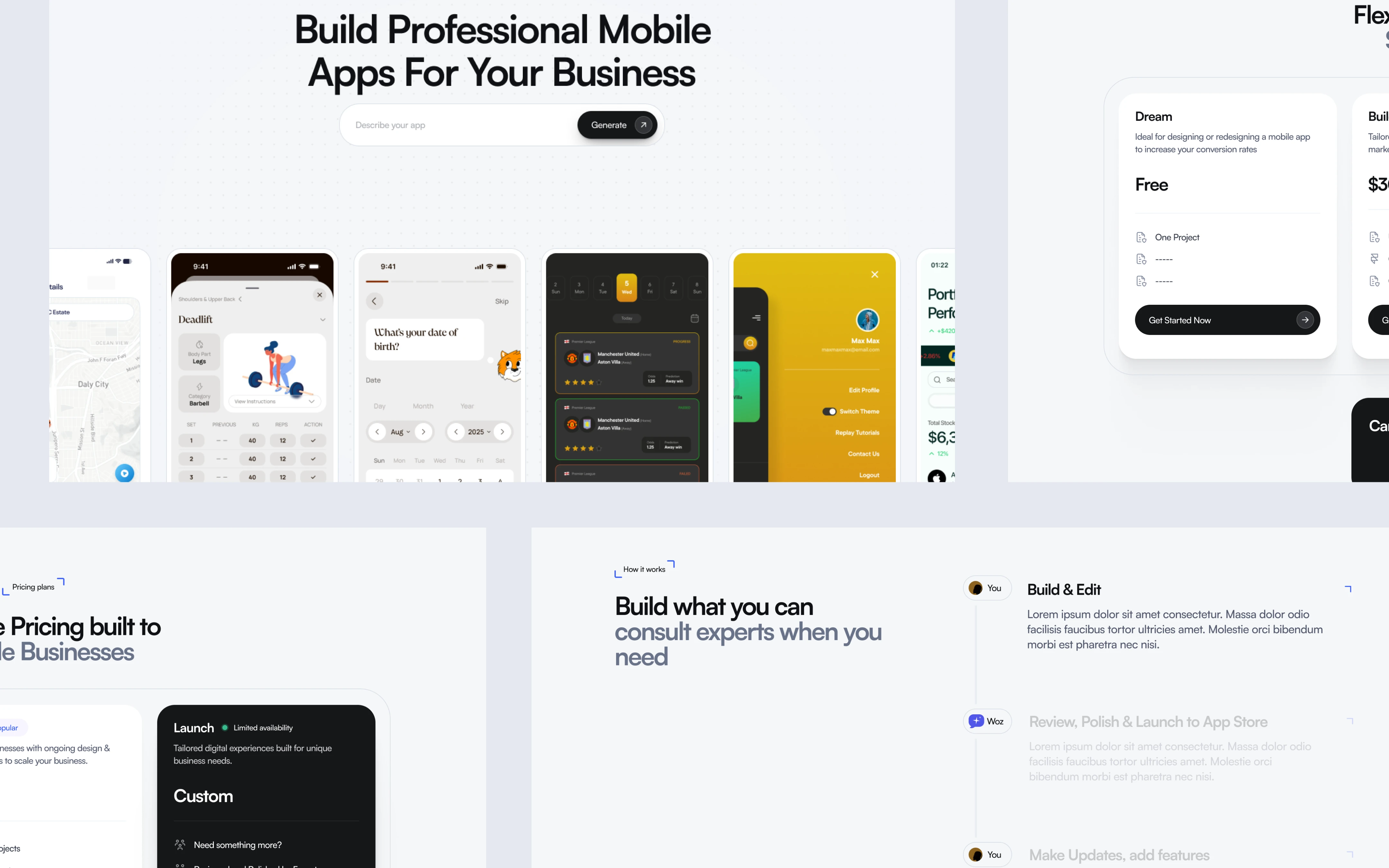
Week 2The first draft had more sections than the product needed. We cut down to Woz's highest-priority value proposition, and the design was approved once the page said one thing well.
The build
After approval, I rebuilt the entire page myself in Framer.
I also worked with their developer to plug in early email capture. And yes, every layer is named.