 Back home


The context
As an enterprise workflow and document intelligence platform, built by a company with twenty-five years in case management. It sells into mining, engineering, construction, forensics, litigation, finance and HR.
Every task the system generates arrives on their inbox compliance feature which has roughly 8,000 documents in motion, around 2,000 organisations and about 1,200 people taking action on a given day, two or three tasks each.
It is the most trafficked surface in the product hence a need to be prioritized.
The problem
Internal managers, external technicians and professional teams all share the same Inbox. On top of that, workflow steps were over-exposed, and permissions quietly showed what every person was allowed to know. The founders called it functional but not intuitive.

The discovery
Dian and Simon walked me through their own product analytics before I drew anything. Users were only interacting with about 22% of the dashboard on a regular basis.
-
Document controllers, external technicians and internal managersInterviews
-
Watching where people stalled inside an itemRecordings
-
Controls carrying traffic vs. controls carrying noneHeat maps
-
Which fields must be legible without a clickSurvey
-
Rounds on wireframes, each feeding the nextUsability TEST

The process
I rewrote the hierarchy before touching a card. And I projected it down to four levels, in the order a person needs them. The entire flow was now clear without competing for each other.
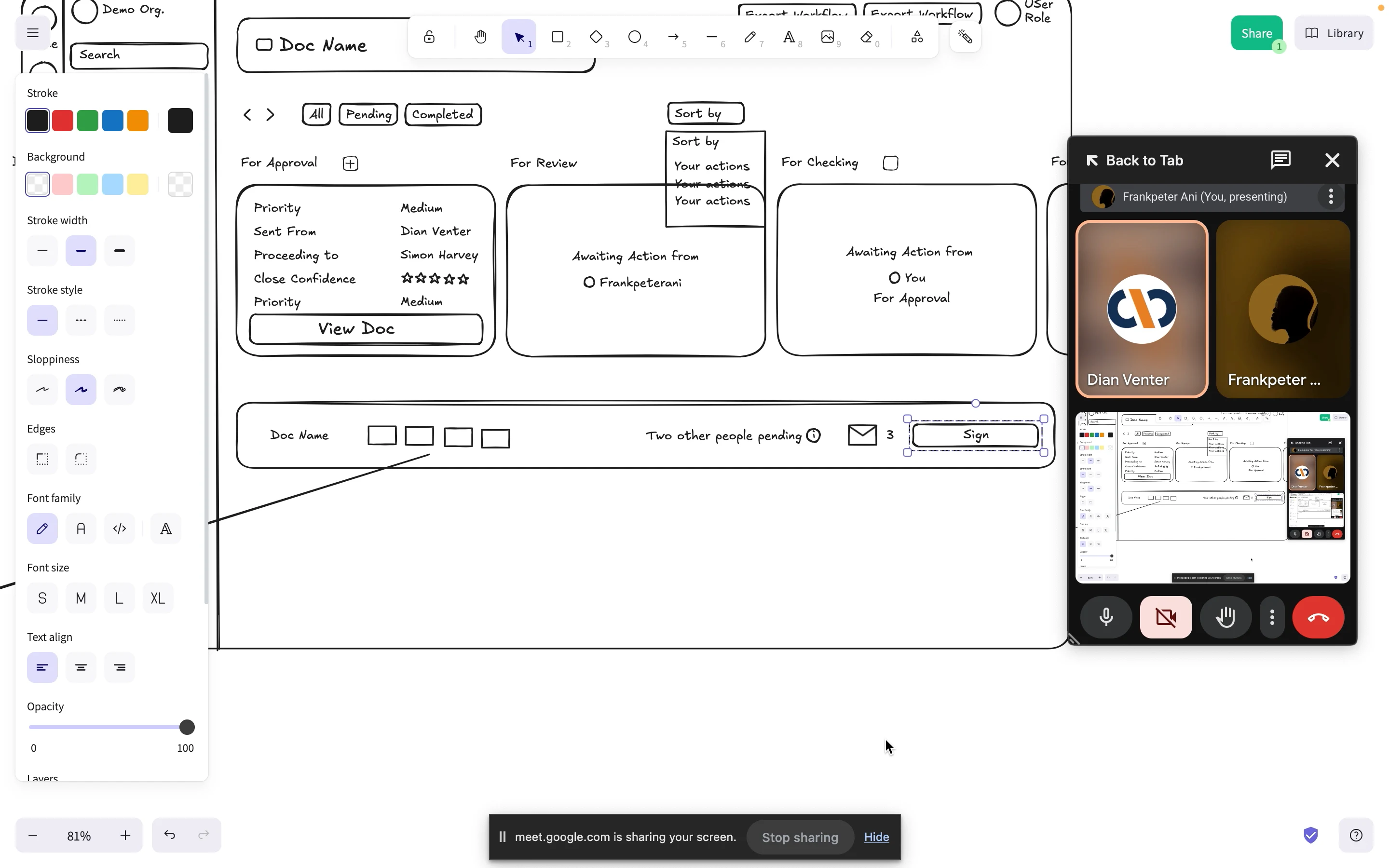
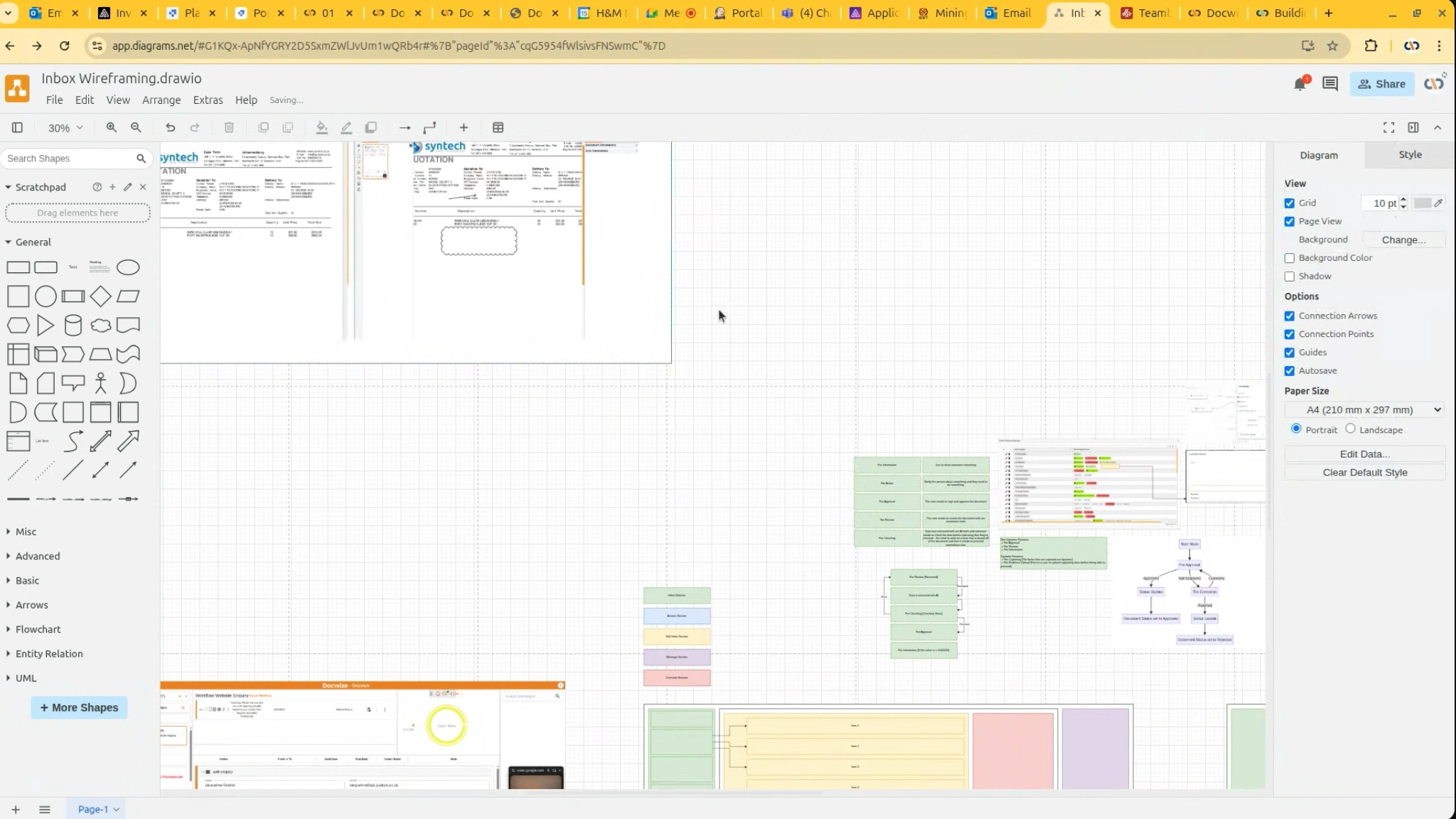
Our simple collaboration flow was excalidraw for flows, until every action could be defended one at a time. Miro and FigJam for sessions with Dian and Simon. Low-fidelity wireframes first, they were deliberately ugly to ship ideas quickly, so the conversation stayed on structure while structure was still cheap to change.
The solution
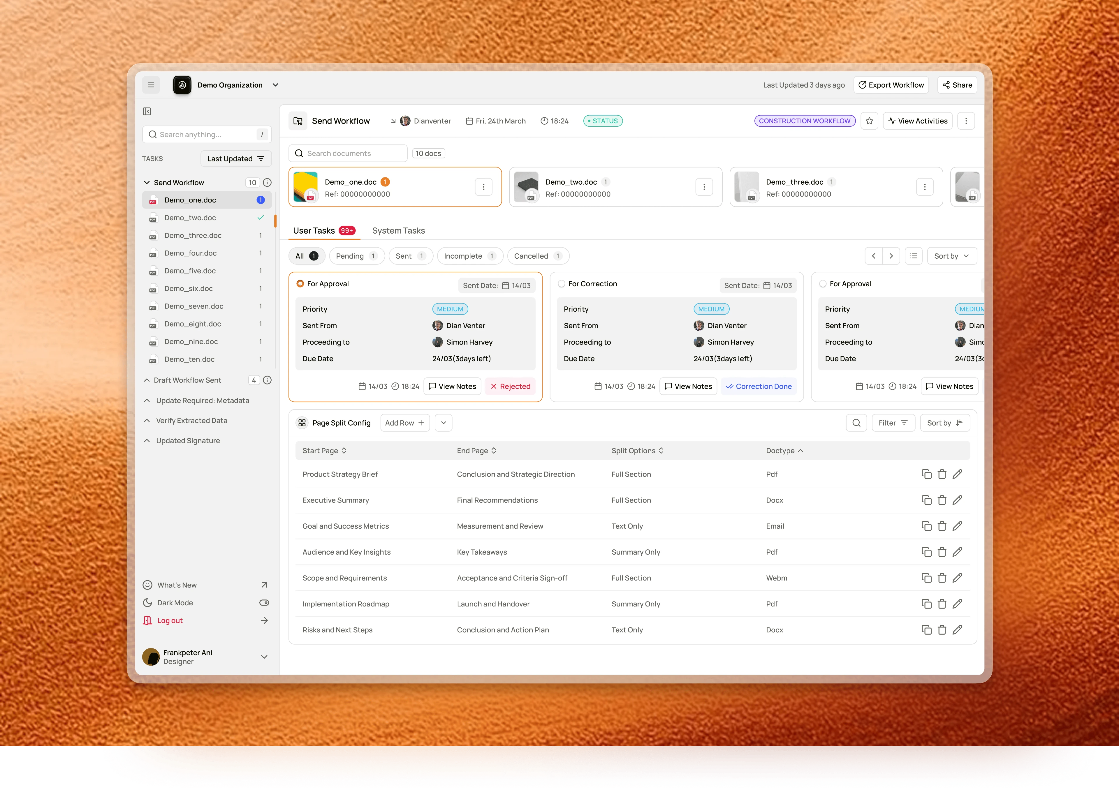
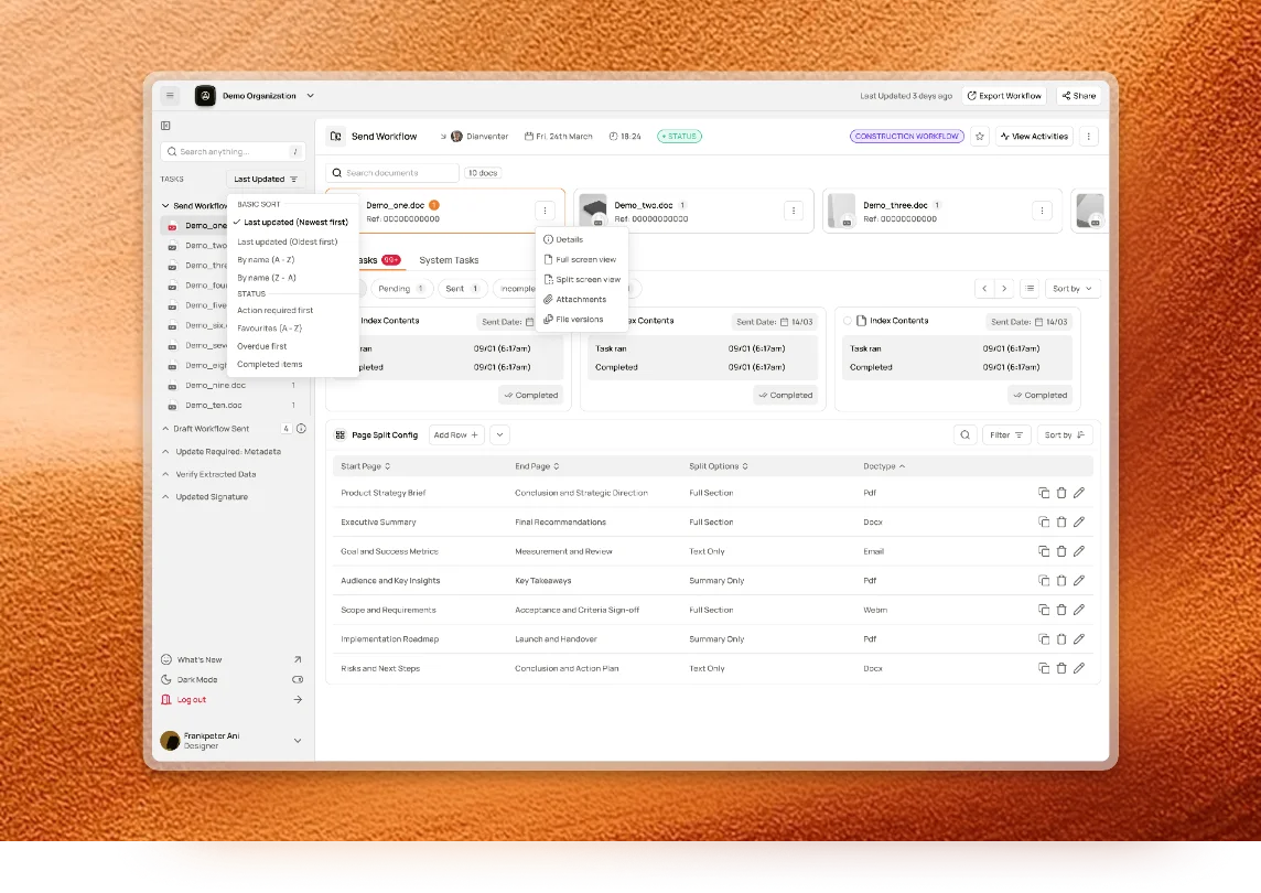
User tasks, system tasks and history, each given a place of its own.
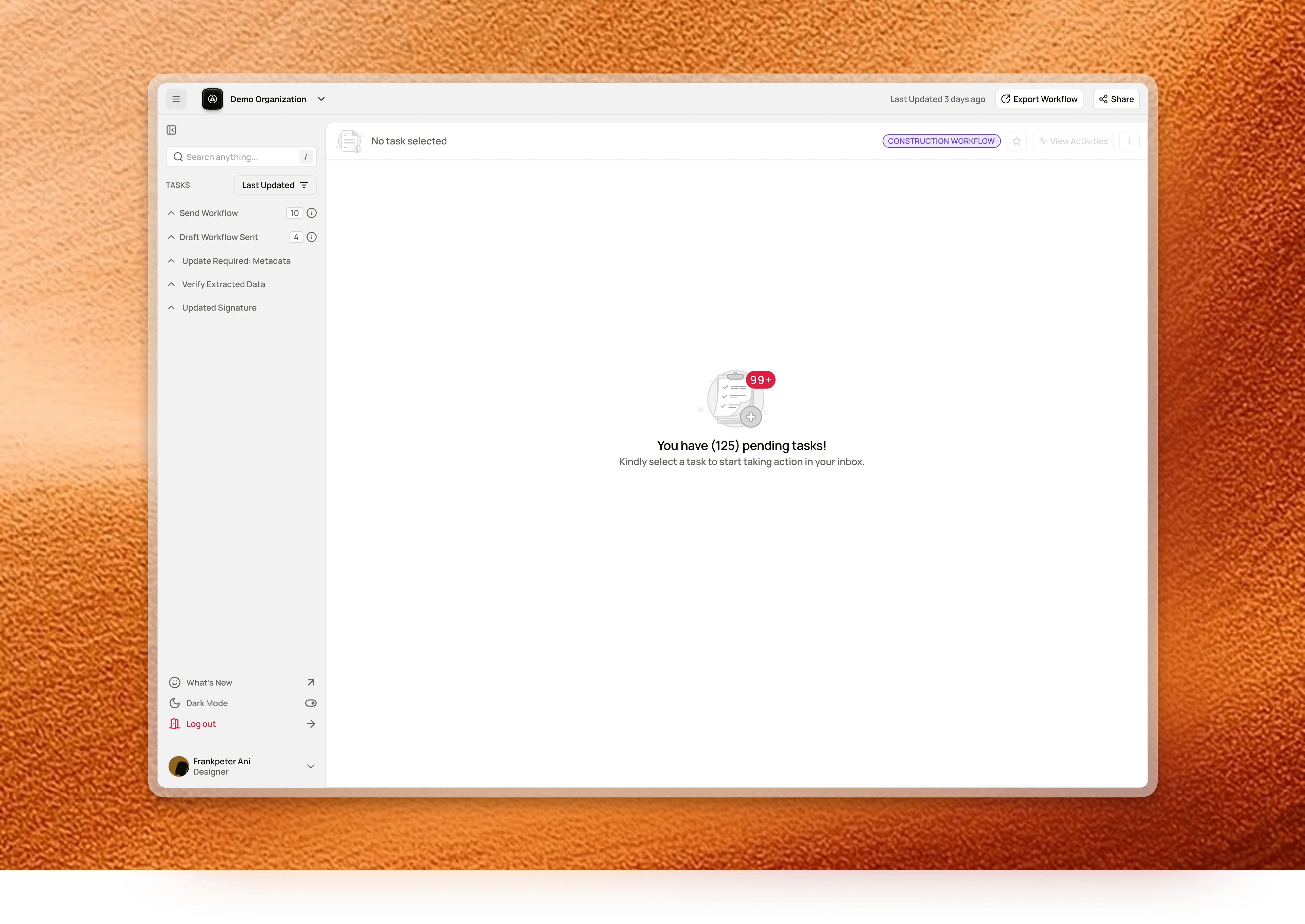
Nothing selected used to mean nothing on screen. Now it reads: you have 125 pending tasks, pick one to start. An empty state on a task surface is the moment before the work.
Index Contents moved to its own tab, with started and ended timestamps and an explicit completed state. You can tell whether something waits on you or on the system.
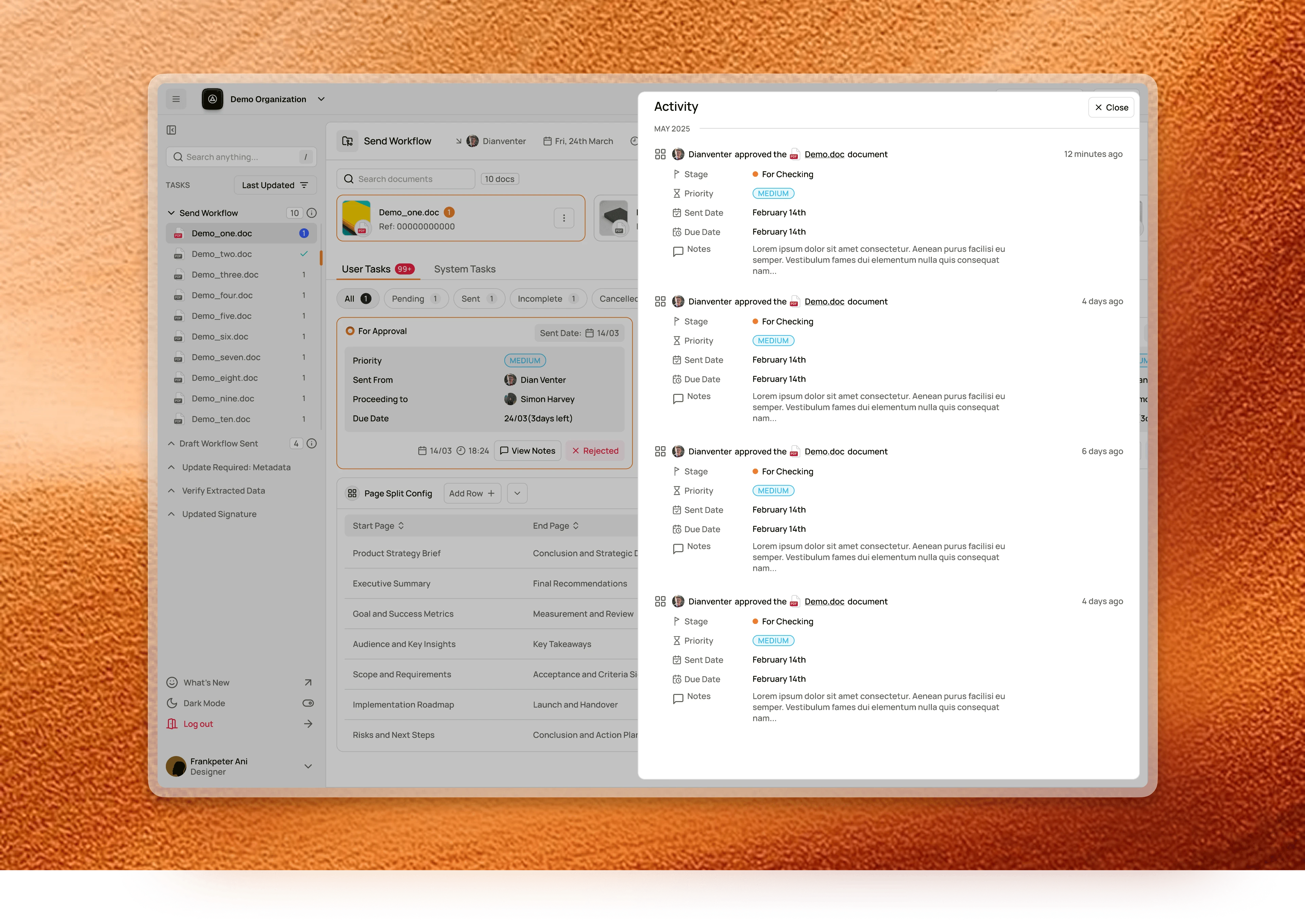
The Activity panel replaced the highlighter: who approved what, which stage it moved to, and the note they left, in order.
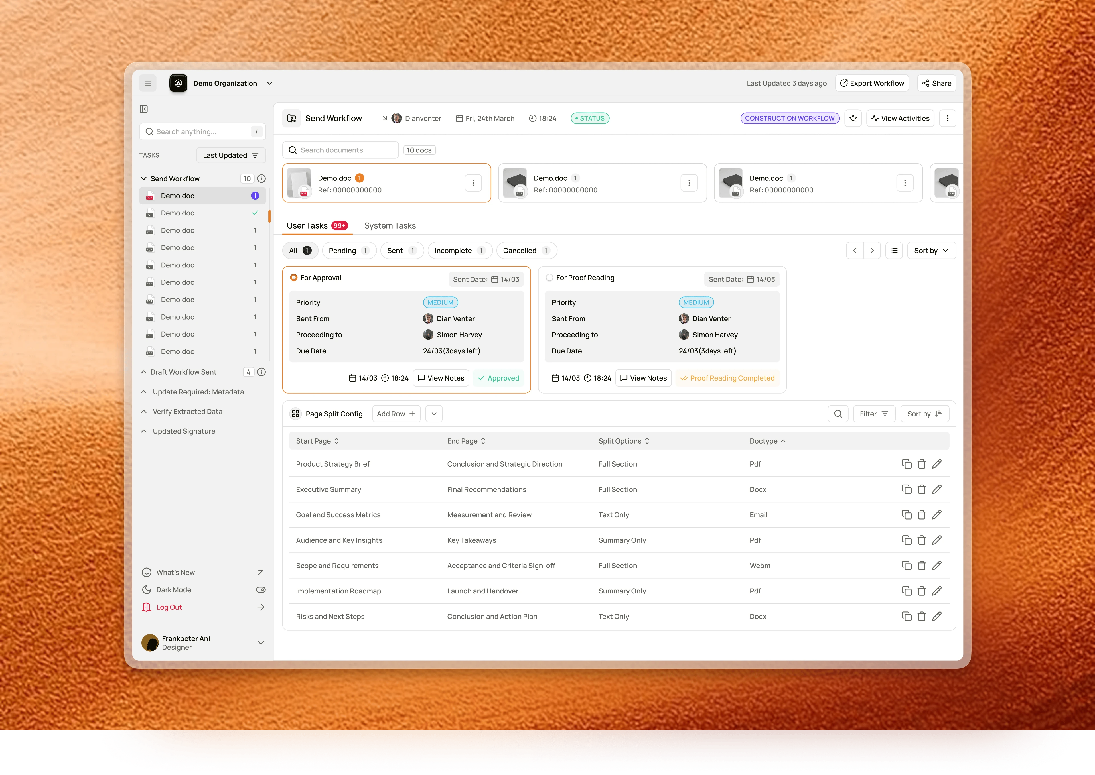
The card carries the answer, not a route to it.
- 01Due date reads what's left for the action you particularly need to take.
- 02Sent From and Proceeding To carry names and faces. You see the chain you stand in.
- 03The outcome sits on the face of the card. A word as the button.
- 04The radio marker is the activator. It marks the live card and opens it.
- 05Sent date, time and View Notes and users and operators can drop comments as a means of communication additionally for each action.
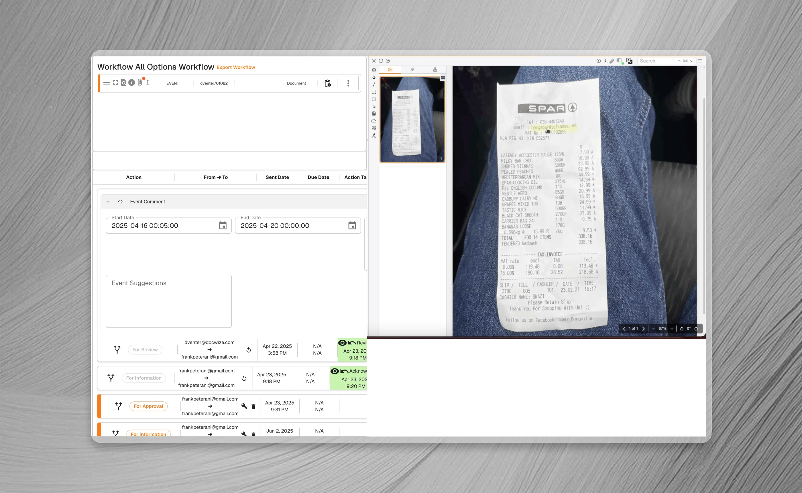
The approval control was living in the window chrome.
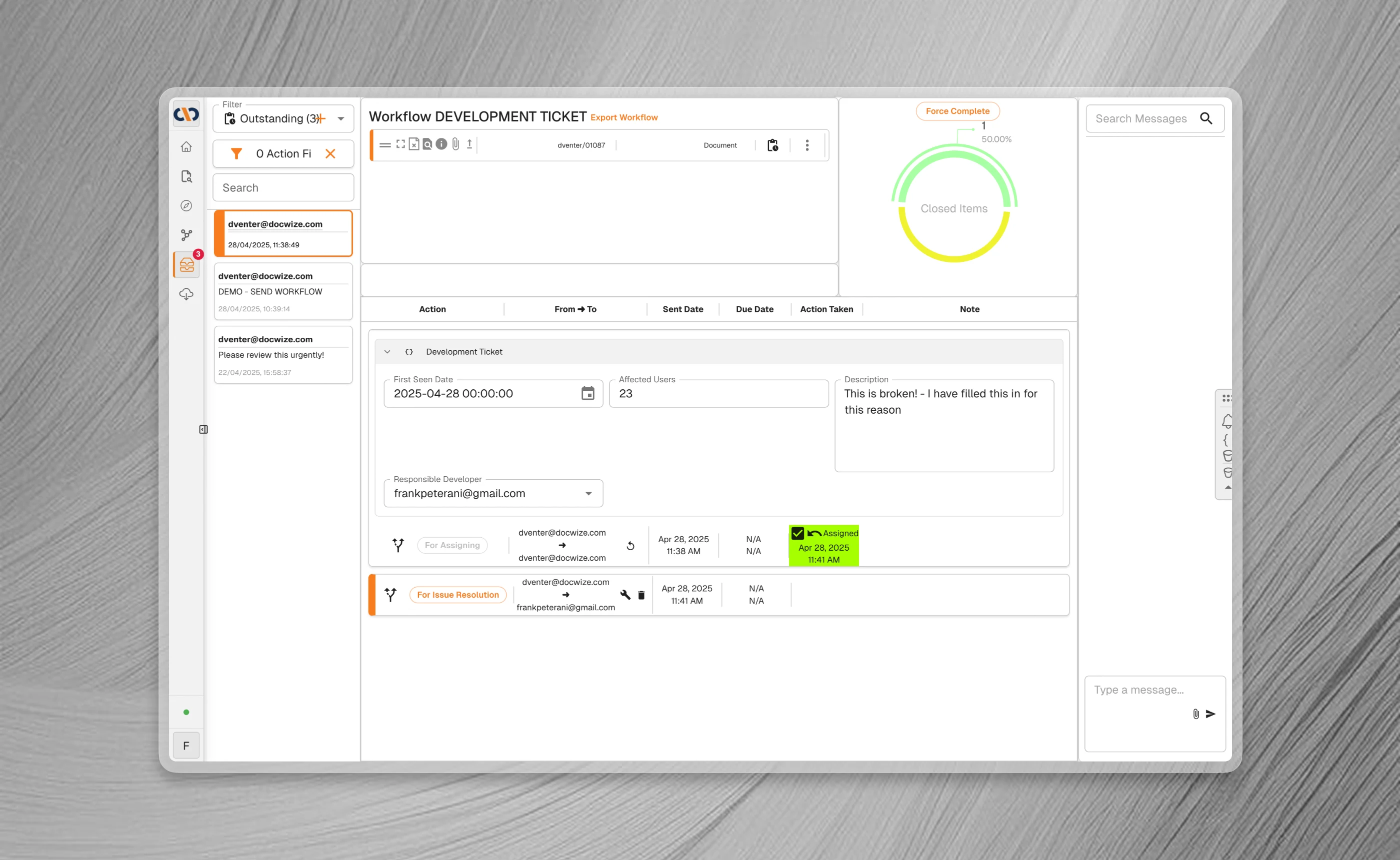
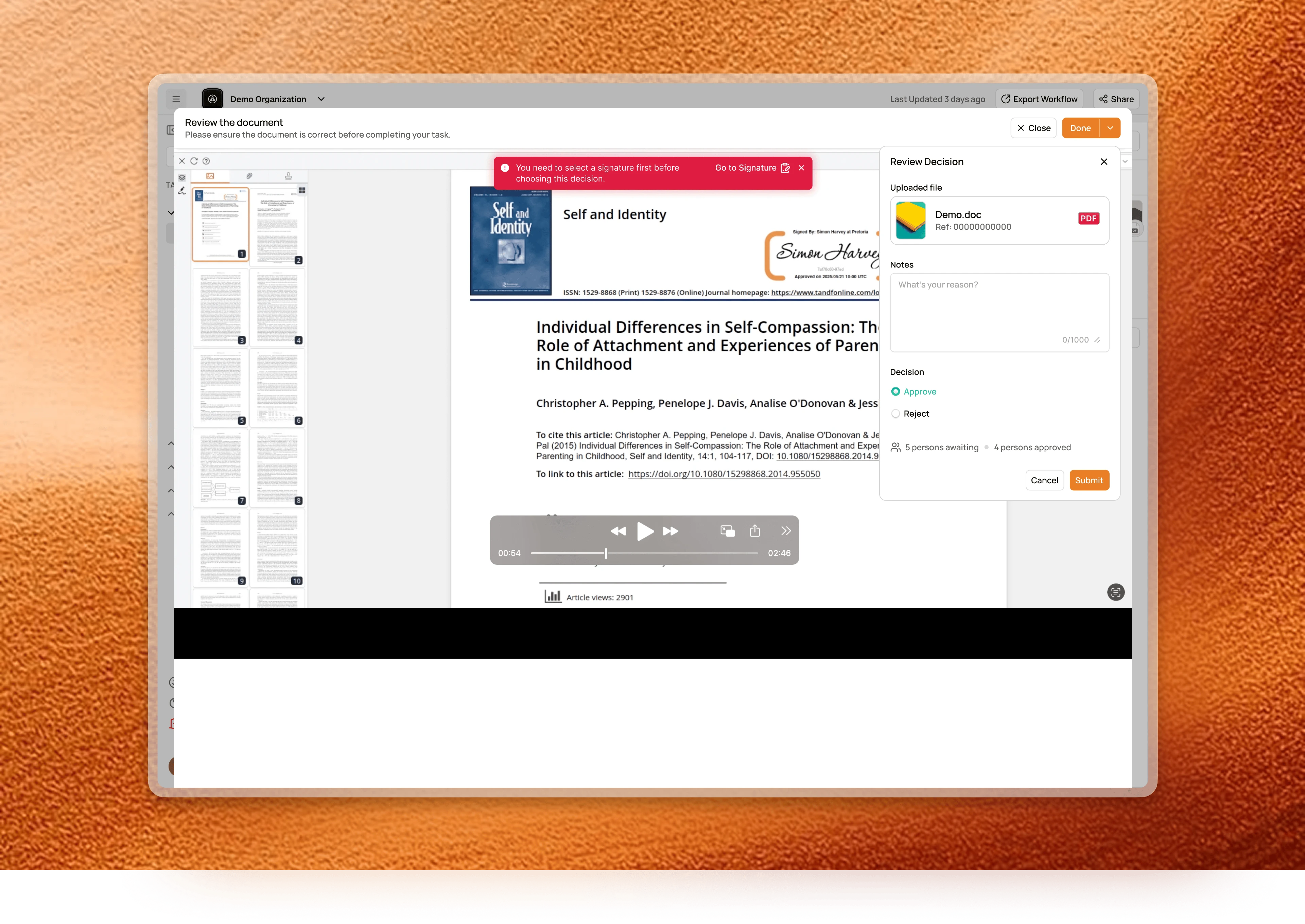
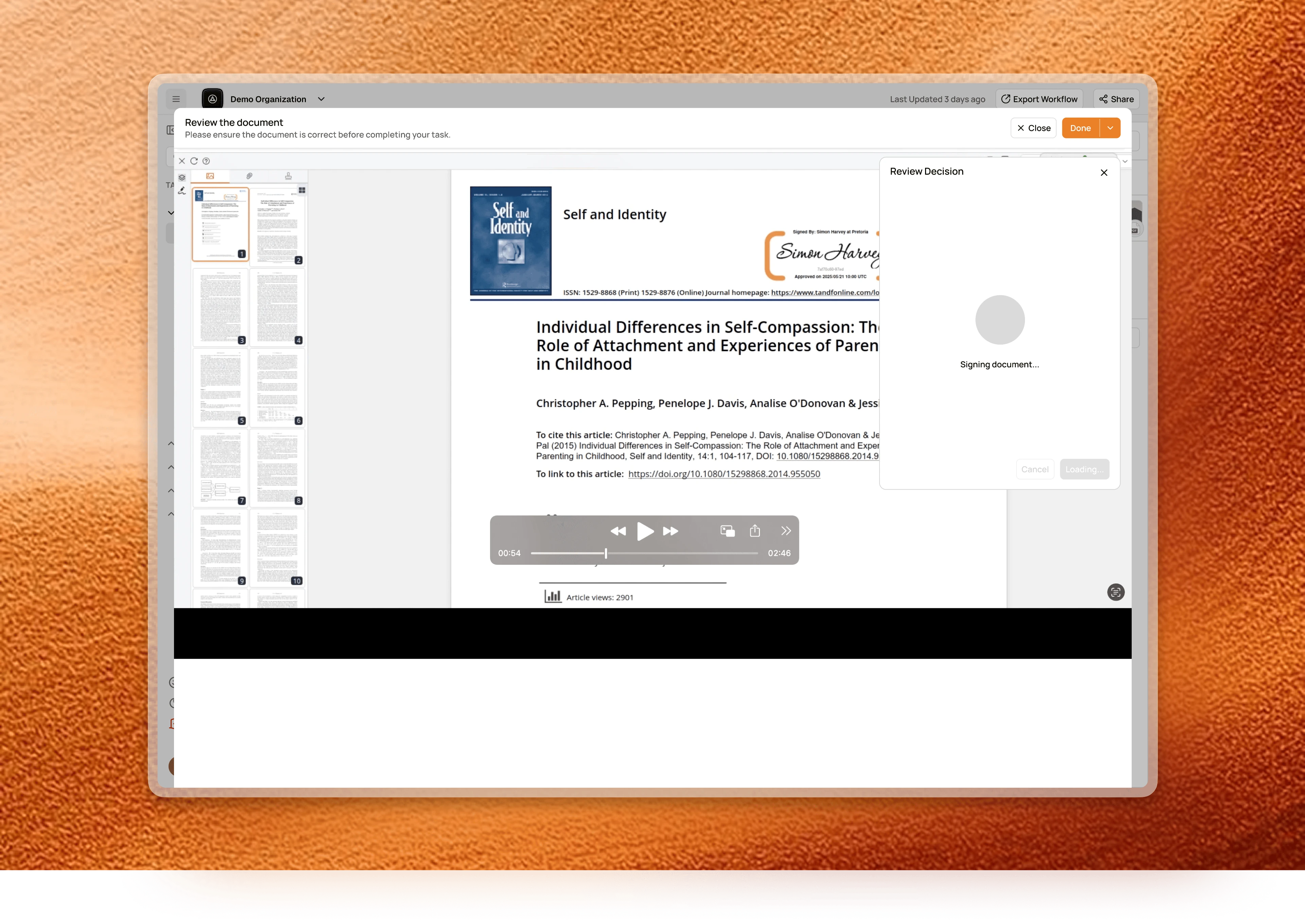
There was initially no signature configured, and a banner says so with a direct route to set one. Signing has its own state, so nobody presses twice on something legally binding.
I asked the engineers what they could build easily before I designed that animation.
The design system
Tokens, variants and a style guide, walked through with the team so it did not rot the week after I left. Variant organisation borrowed ideas from Google Material and Airbnb. Eventually, most of the handover was mostly about rules.
- 01Critical action visibility. A primary action not visible without scrolling pins to the bottom of the view.
- 02Split panel ratios. 70 / 30, both with a 320px minimum, scrolling inside the panel.
- 03Mobile split. Below the breakpoint the split becomes a tab switcher, Workflow and Document.
- 04Default table state. Side navigation collapses by default. The table needs the room.
- 05Radio as activator. One pattern, everywhere.
The impact
The problem was only visible in behavioural data, so the fix is judged the same way: task completion against the 80% baseline, time to first action, clicks per approval, and decisions submitted with a note.
The conclusion
The Docwize team brought me back as a fractional designer for their next product, the Oliver AI sync platform.
That engagement was agreed immediately after the Inbox feature went into development. Since the build, I have not heard back.
